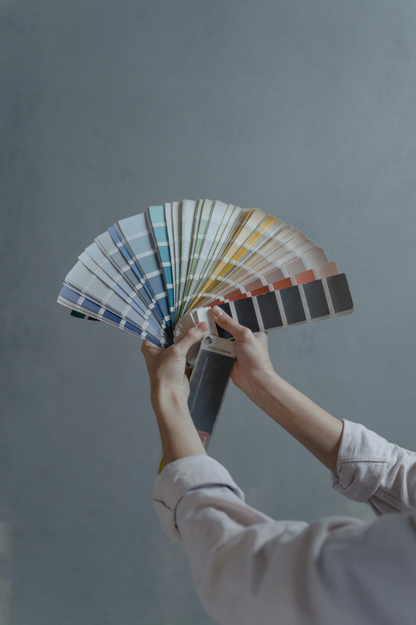
You finally got the floors—sleek hardwood, bold tile, or plush carpet. But something’s off. The walls. They don’t vibe. Instead of a designer dream, it’s giving “mismatched socks” energy. The fix? Pairing your floors with walls that actually get along. Let’s make some magic.
The Floor Sets the Tone
Floors are the base. Walls are the outfit. Get them working together, and your space instantly upgrades from “meh” to “move over, Pinterest.”
Light wood floors give off an airy, relaxed vibe, so they need walls that keep that easygoing energy. Creamy whites, warm beiges, or soft grays keep everything light and fresh without overpowering the space.
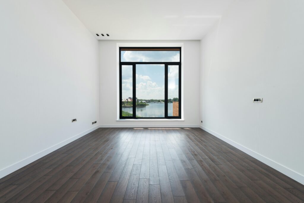
Dark floors are rich and dramatic, but they need the right walls to keep things from feeling heavy. Taupe, muted blues, or olive greens balance out the depth and make the room feel inviting rather than overwhelming.
Gray floors? They’re sleek and modern, which means they pair best with cool tones like soft blue, charcoal, or sage green.
But warm colors like yellow or red? Big mistake. They create an awkward contrast that makes the space feel mismatched. It’s like putting ketchup on pancakes—just because you can doesn’t mean you should.
Cohesion vs. Contrast: Pick a Side
Want that seamless, put-together look? Keep walls and floors in the same color family. Light gray floors with greige walls? Smooth. Effortless. Classy.
Prefer a little drama? Contrast is your bestie. Dark floors with crisp white walls? Timeless. Light floors with deep moody walls? Cozy and bold. Just don’t get too wild—too much contrast can feel chaotic. Stick to the 60-30-10 rule: 60% dominant color (walls + floors), 30% secondary (furniture + cabinets), and 10% accents (art, pillows, rugs). Think of it like an outfit—balanced, but with a little flair.
Room-by-Room Breakdown
Every room has its own vibe—let’s make sure your floors and walls are setting the right one.
The living room is where first impressions happen. Warm wood floors love neutrals, terracotta, or muted greens for that “come on in” cozy feel. Cool floors? Moody blues or soft grays keep it sleek. Want a bold move? A deep green or navy accent wall is the ultimate showstopper.
The kitchen and dining area need balance. Dark floors? Light walls—crisp white, soft sage, or dusty blue keep things airy. Light floors? Taupe or greige brings warmth without taking over. And the backsplash? It’s the little detail that ties everything together—don’t skip it.
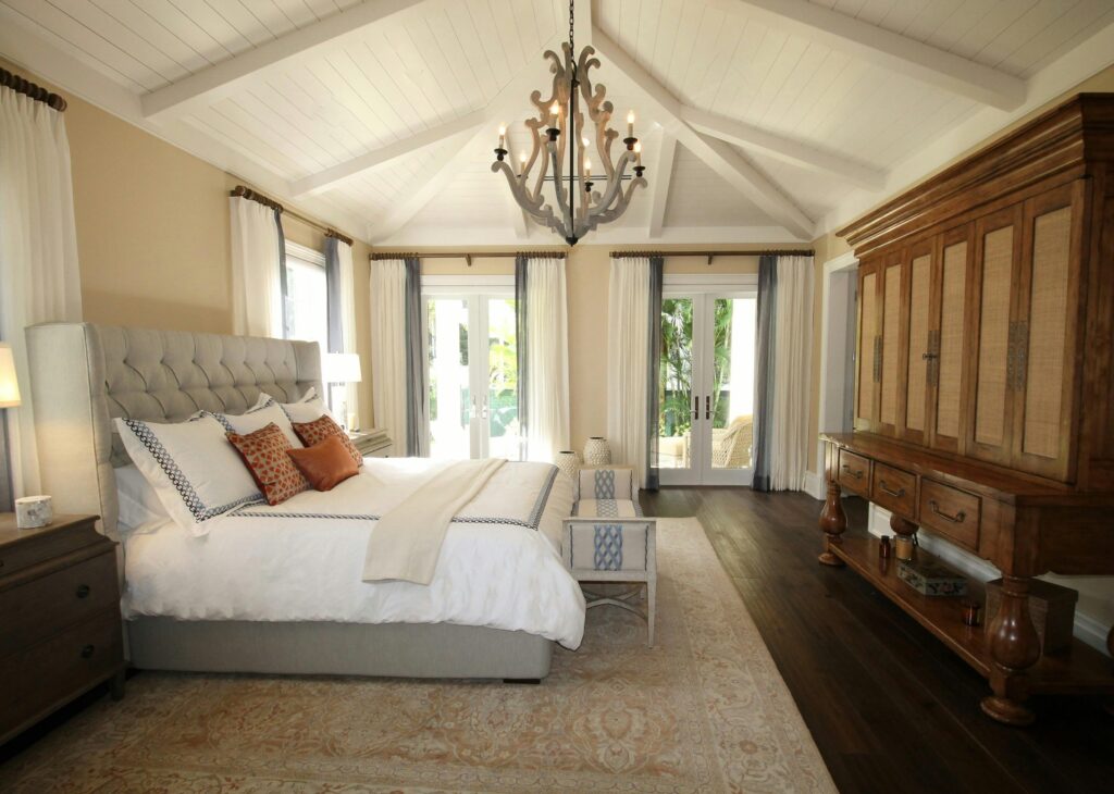
Bedrooms should be a whole vibe. Dark floors? Wrap the space in deep navy, charcoal, or moody greens for that “high-end hotel” feel. Light floors? Soft pastels, muted blues, or warm neutrals keep it breezy and relaxing. Pro tip: Layer it up—rugs, cozy bedding, and curtains make all the difference.
Bathrooms deserve some color love too. Gray or white tile floors shine with spa-like hues—soft blush, powder blue, or seafoam green for a fresh, serene look. Dark tile floors? Crisp white or warm beige walls keep things feeling clean. And lighting? A total wild card. Colors shift from morning to night, so test swatches before you commit.
Home offices need focus and inspiration. Warm floors? Cool whites, grays, or soft blues keep the space fresh. Cool floors? Taupe, sandy beige, or greige prevent things from feeling too sterile. Want a creativity boost? A deep teal or forest green accent wall behind your desk is an instant upgrade—and makes Zoom calls look extra pro.
The Painter’s Secret Weapon: Finishes & Expertise
A pro painter doesn’t just slap color on the wall. They analyze lighting, match undertones, and make sure your space doesn’t turn into a color regret. Ever picked a paint swatch that looked perfect in the store but completely different at home? Yeah. A pro makes sure that doesn’t happen.
We teamed up with a painting company from Palm Springs, CA for a mid-century modern refresh, and the results were chef’s kiss. Palm Springs is known for its famous painters like Maynard Dixon and Conrad Buff and we thought it would be fitting to choose Palm Springs CA house painters for our latest project. Light oak floors got warm white walls with a beige undertone, letting sunlight do its thing. The kitchen? Soft sage green + terrazzo-style tile floors = effortless California cool. The takeaway? Thoughtful color choices make a home feel right.
Avoid These Common Mistakes
Chasing trends without considering your floors? Big mistake. What looks amazing online might be a disaster in real life. Always test first. Ignoring lighting? Colors shift throughout the day—what’s dreamy at noon might be dull by night. Check swatches in different lighting before committing. Forgetting about furniture? Walls and floors are the foundation, but your décor pulls everything together. Make sure it all plays nice.
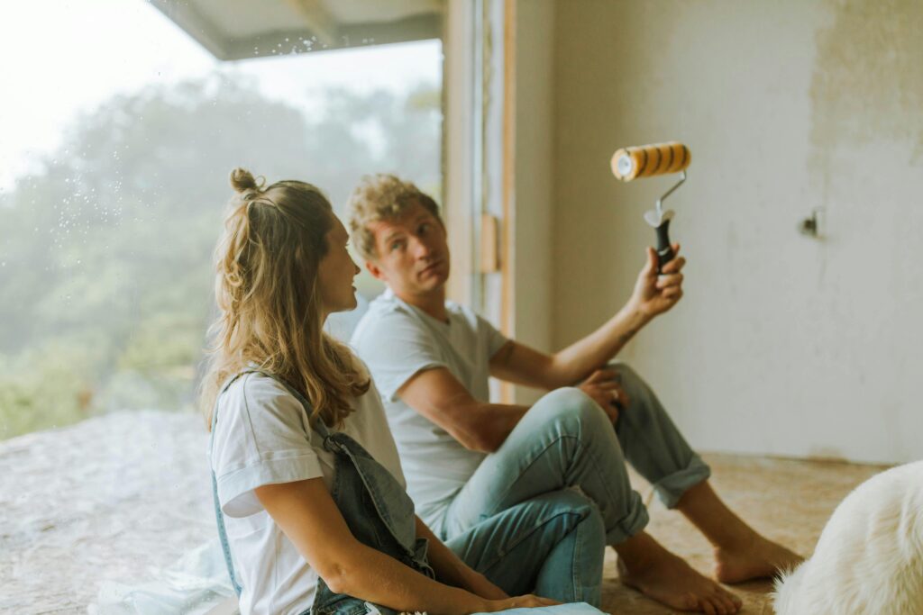
Thinking DIY is foolproof? Painting seems easy… until you’re staring at streaks, uneven coverage, and regret. Sometimes, hiring a pro saves time, money, and stress.
Your Dream Home Is a Paint Swatch Away
Creating a home that feels good isn’t about blindly following trends—it’s about balance. Whether you love soft neutrals or bold contrasts, the right floor-to-wall combo makes all the difference.
Stick to the 60-30-10 rule. Test colors in different lighting. And if you want a flawless finish without the stress? Call a pro. Your walls—and your sanity—will thank you.
